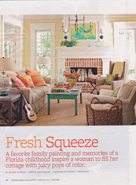
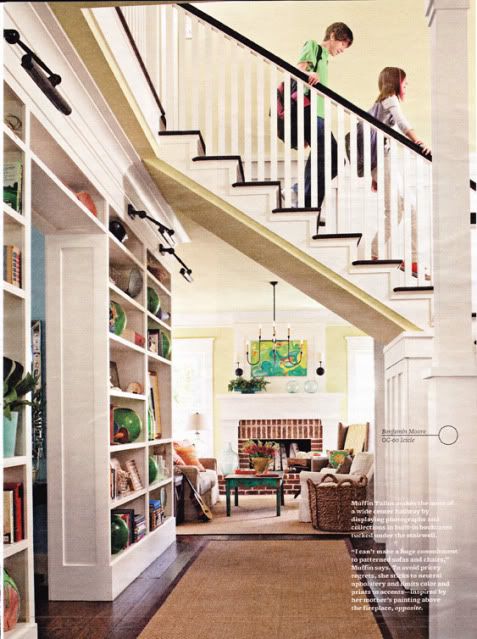
 This stair case is one of my all time favs! I love the built-in shelving and how that hall just looks so perfect right there leading into the family room.
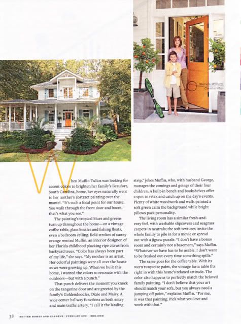
Little pops of Aqua and orange all over, even on the outside of the house. I love that it's mostly white, the white makes it classic and the bright colors hint at what's inside. And how fun is that front door??
Of course I always love me a fresh white kitchen. Commercial grade gas ranges always come in handy too. :) My dream house has one of those for sure. I love the color on the island in this otherwise crisp white space. It's perfection!
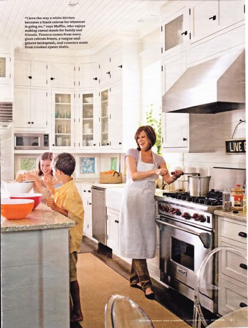 I ripped this whole story out and put the whole thing in my inspiration file. There are a few more rooms featured, but these were my favorites. I hope you all enjoyed it as much as I did!
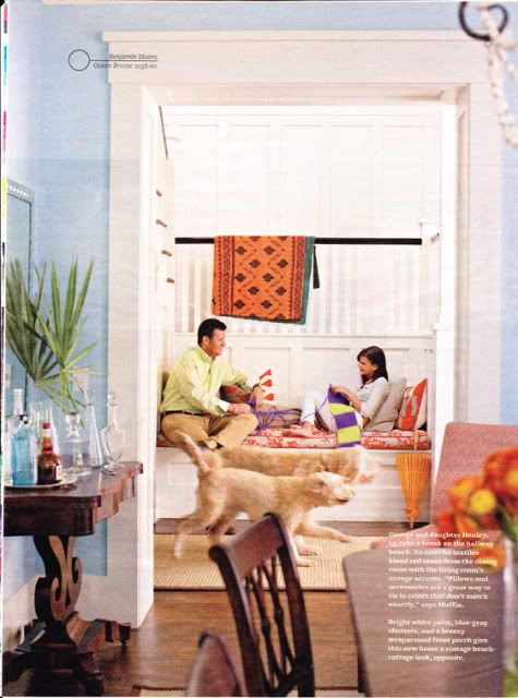
So (in my opinion) why this works so well... the oodles of white trim tie every room together, the huge windows let in lots of natural light, the color palette repeats throughout the house, some rooms add in a few more colors, but they all have at least one or more of the colors in the main palette. It fits the family who lives there, and she created a space with meaningful things. Very well done. I'm taking mental notes. We can all do this in our own way with things and colors that inspire us!

I remember when I got my February issue. When I saw that house my eyes lit up. I love all of use of color in there. It's so bright and fresh! I think I looked over those few pages quite a few times before putting the magazine down lol.
ReplyDeleteThis is so funny because I ripped all of those pages out for my inspiration folder, too! Because we are in-between houses right now, I've been doing a lot of thinking about what I want our next place to feel and look like. I loved how homey yet traditional she made everything feel.
ReplyDeletei did the exact same thing!!!! love love love it!!!
ReplyDeleteI love BHG - the pages I've turned down for inspiration are countless!!
ReplyDeleteI feel in love with that house the minute I saw it! I ripped out the pages, too! lol Looks like the owners inspired a lot of us. I just loved the small pops of color everywhere. The entry way is amazing!
ReplyDeleteI just found your blog. I really love your style. I need to incorporate more color like you do.
ReplyDeleteoooo i love it too! that staircase is the coolest ever. especially with the black trim. i'm going to have to find a copy! :)
ReplyDeletemeg
Thanks for sharing that article - love that house as well but missed the article (likely because I am in Ireland and not the US!). Thanks again,
ReplyDeleteMeagan
The Row House Nest
www.rowhousenest.com
Houses with huge windows are what I prefer. They allow more natural light and fresh air inside. Plus, you can hang colorful and warm curtains on them whenever you want to. I'd surely be delighted to live in that cozy, nice house.
ReplyDeleteYour style is very unique compared to other people I have read stuff from. I learn a lot of new stuff right here! I certainly love this. Thanks
ReplyDelete